Innersight Lab
Pt2 - Medical interface UI & UX design
'AI and machine-learning powered medical 3D imaging company.
Mission: help surgeons produce improved surgical plans.'
Video showing the existing interface.
Existing Interface
The existing interface has a number of shortcomings, both in terms of its appearance and interactivity.
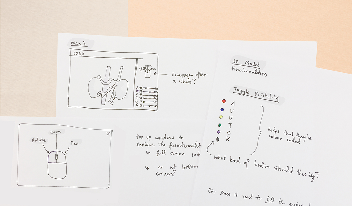
In terms of appearance, the positioning of the buttons are not in the most convenient location. The icons do not communicate their functionality straight away. Furthermore, the pop-up window that appears unnecessarily covers a large portion of the 3D model. It is annoying to close and reopen these windows numerous times. In terms of functionality, it is not explained to users that the left, middle and right buttons on the mouse are associated with rotate, zoom and panning functions. Overall, the existing interface offers a number of opportunities for improvement, to improve the user experience.
Proposed Interface for 3D models
In my proposal, the functionality of controlling the visibility and transparency of different components are made visible right away. They are placed at the bottom right corner of the screen for easier interaction, catering to the large majority of people who are right handed. Visibility of different components can be switched on and off by clicking on boxes, while transparency is controlled via the slider. It additionally proposes the functionality of adding notes and saving a specific view, for ease of referring back to it later. The proposed layout eliminates the need for existing pop up windows, which significantly reduces the number of clicks needed.
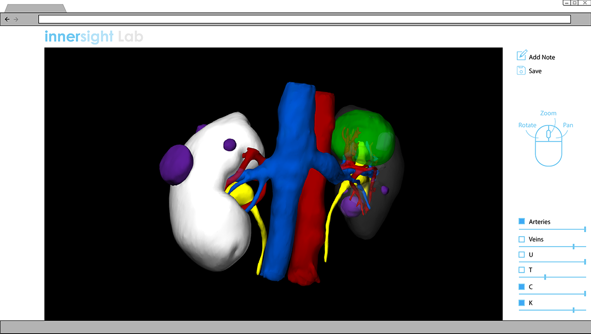
Functionalities of rotating, zooming and panning are concisely explained by the mouse icon. The intention is for it to disappear after some time, once users become familiar.
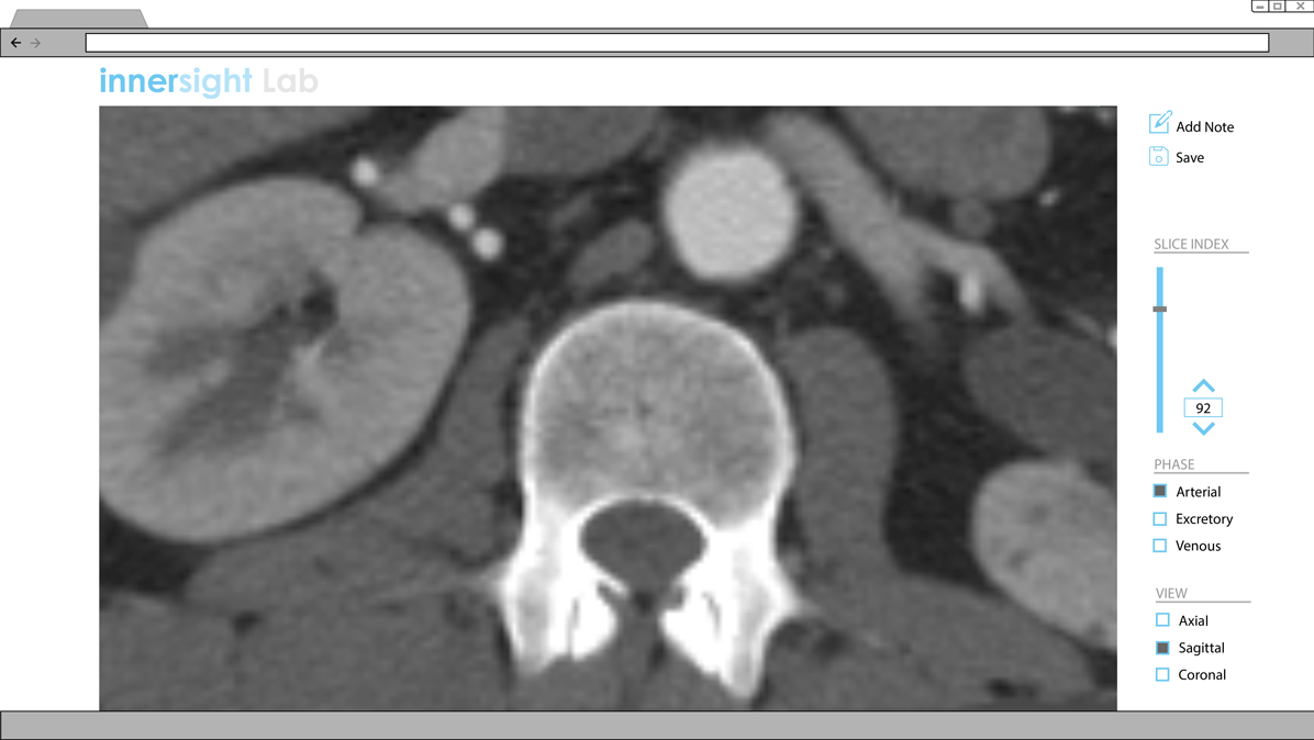
Proposed Interface for CT scans
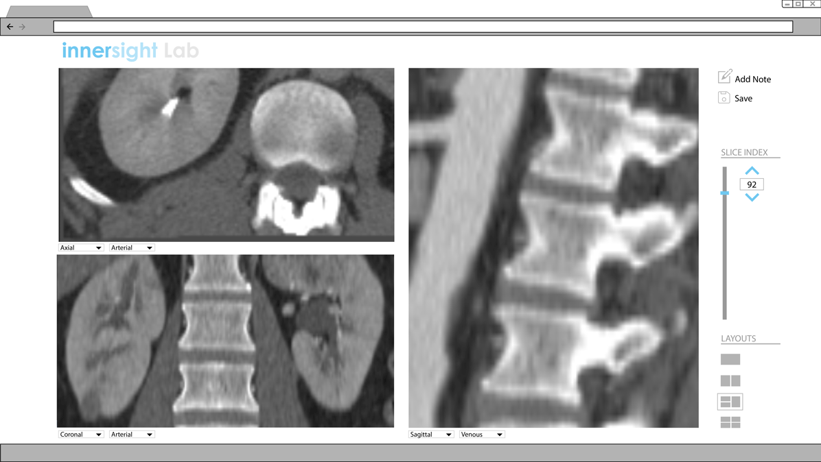
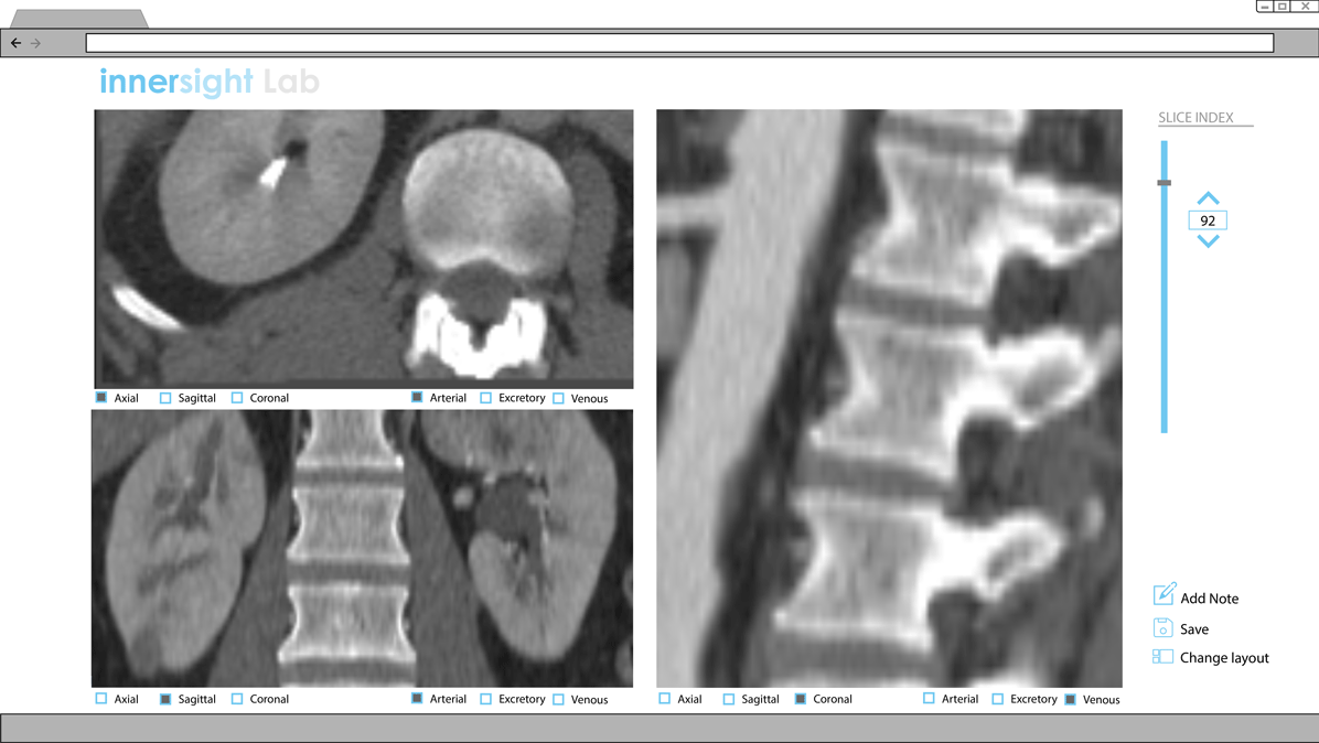
The logic of presenting functionalities to users without having to open various buttons is applied to the interface for CT scans. Presently, a dropdown menu is presented at the top right corner to toggle between the various phases and views.
Proposal for Multi-View layout
Version 1
Control what's shown by clicking and unclicking boxes.
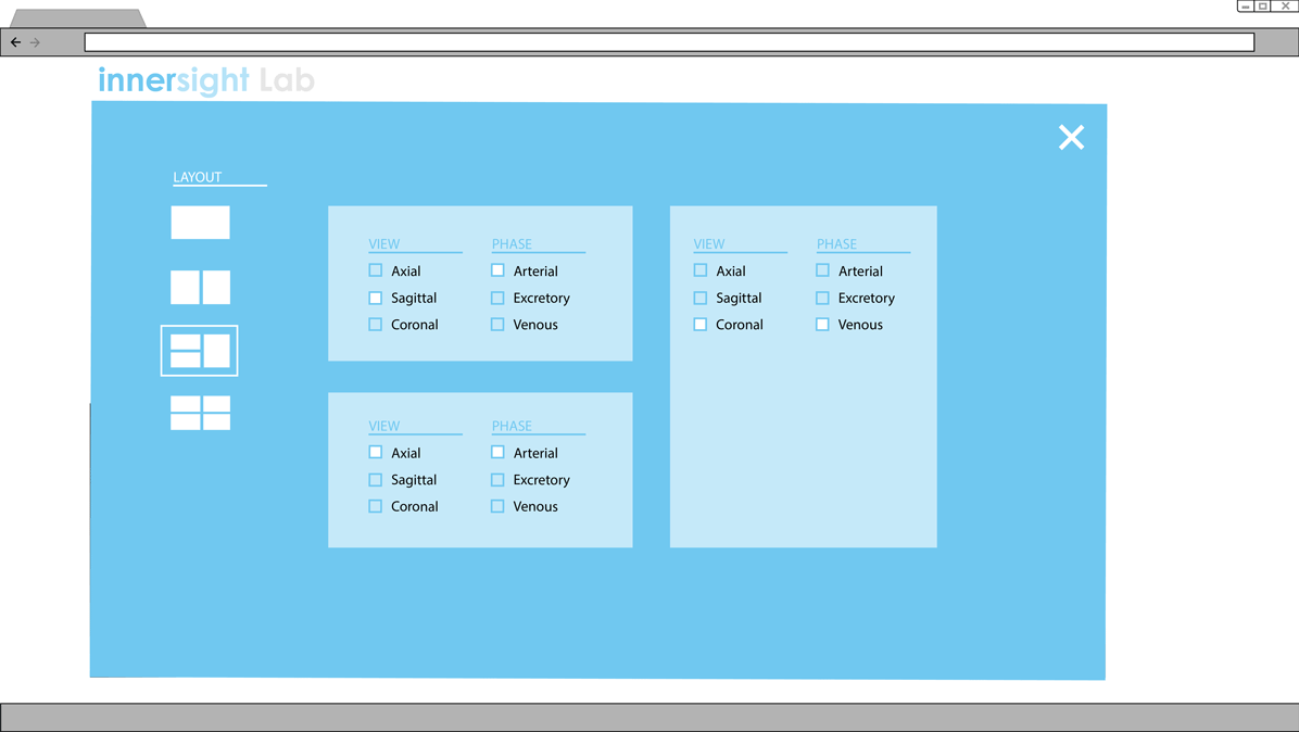
Clicking the 'Change layout' button opens up this menu.
Version 2
Control what's shown by the dropdown menu. Toggle between various view configurations by the icons.
