Innersight Lab
Pt1 - Website design
'AI and machine-learning powered medical 3D imaging company.
Mission: help surgeons produce improved surgical plans.'
Video showing the current homepage, updated following my input.
My role:
I came onboard the project on an advisory basis, giving feedback on the UX UI of their existing website and imaging interface. I was pleasantly surprised to see my feedback incorporated so speedily into their website. I had provided just a mockup of the website, so there are a number of details in the current version that I’d like to improve on in the near future. It’s a project in progress, with more updates to come.

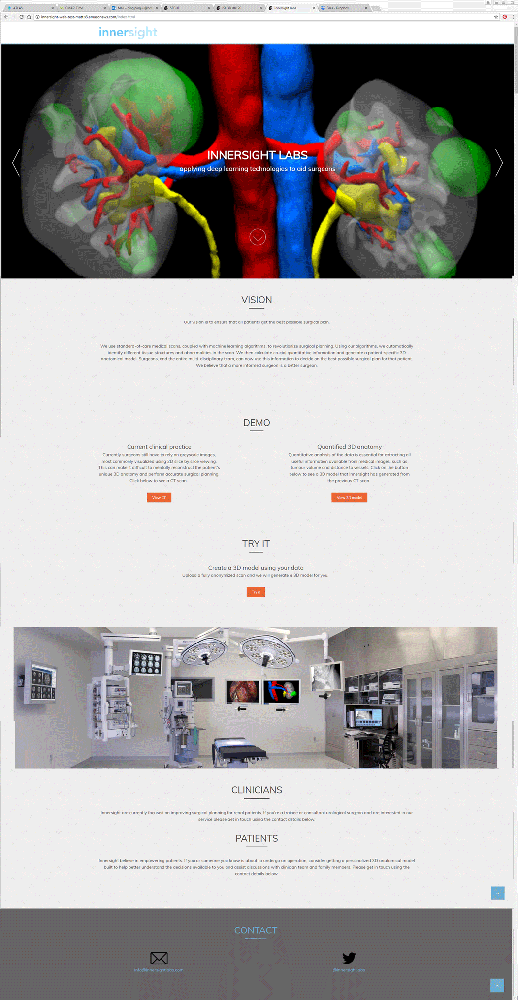
Old Website
When I first saw their old website, it took me some digging to understand what they do. It did not do the organization’s work justice. Information was scattered across different pages, and the visual presentation buried some important information. The colours as well were not entirely fitting.

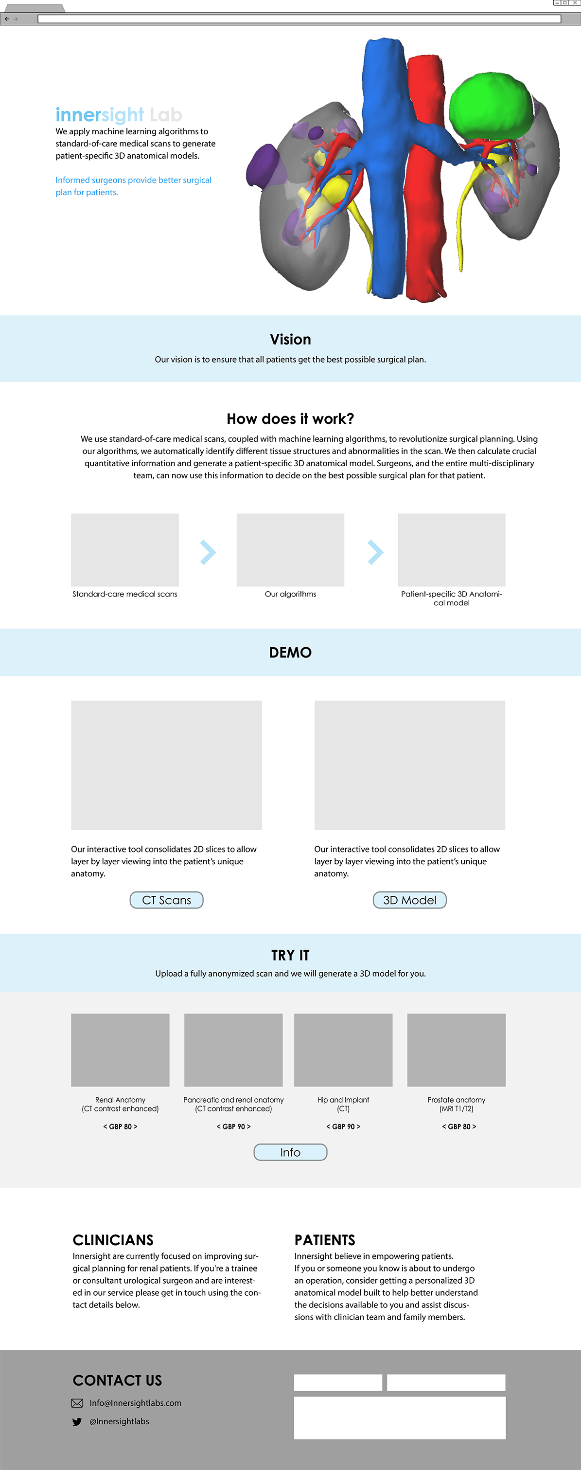
Proposed Website
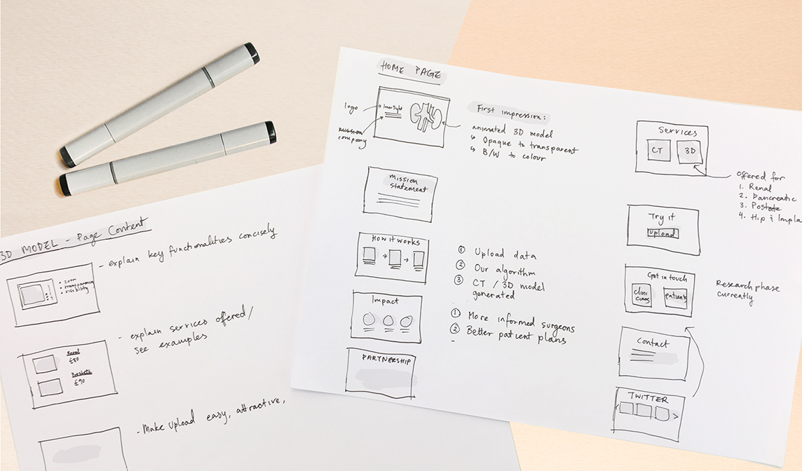
To improve the first impression for visitors coming to the sight, the black and orange colour palette was updated to be white and blue (to match their existing logo). Setting the 3D model scan on a white background gives it a cleaner, and more ‘medical’ look. I recommended animating the 3D model to further promote the interactive element of their software. Beyond these aethetic improvements, some amendments for the presentation of the content were proposed. My proposals respects the structure of the existing site for the most part, but also brings to surface relevant information from child pages.
